Tile Appearance
In the tile editor, the Appearance tab controls the tile's entire look: shape, sizes, what's shown on it and which colors it has. Every change is reflected immediately in the tile's live preview, so you see exactly what you're getting.
Shape
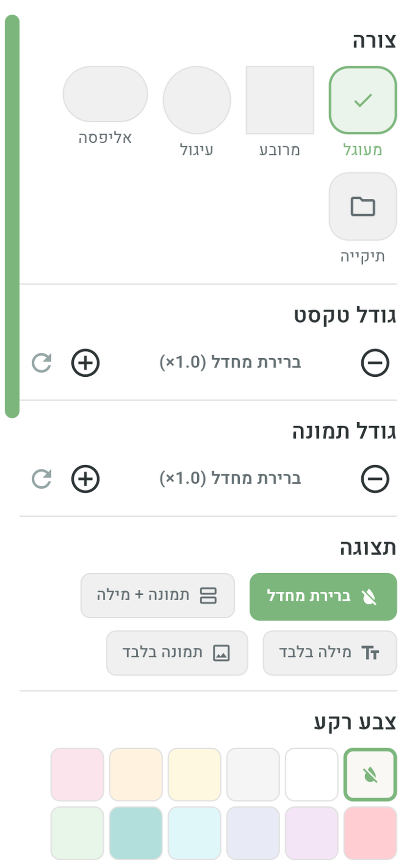
Five shapes to choose from: Rounded (the default), Square, Circle, Ellipse — and Folder.
The folder shape is meant for tiles that open another board: anyone who sees a folder-shaped tile immediately understands “this isn't a word — it's a gateway to another board”. It's a good idea to give it to every navigation tile on the board. How to turn a tile into a navigation tile — see Tile actions.
Text size and image size
For each tile you can adjust the Text size and the Image size separately — by tapping the plus and minus buttons, in gentle steps. This is useful when a long word gets cut off, or when you want to make an important tile stand out. Changing image size zooms it within a fixed area; the label always remains at the top of the tile, close to the image, and never moves or overlaps it.
As long as you haven't changed anything, the tile uses the board's default values (set in board settings). Tapping Reset to default beside image size removes the tile override — it no longer has a separate value and inherits future board-size changes. On top of that, the global size in Accessibility multiplies either the inherited or custom tile size.
Display
What's shown on the tile:
- Picture + word — the full, most common display.
- Word only — for skilled readers or connecting words.
- Picture only — for those who don't read yet, or for clean visual boards.
- Default — follows the board's setting.
Colors and border
Four color sections:
- Background color — a wide range of light and bold colors, plus special gradient backgrounds (rainbow, sunset, ocean, forest and more) — great for game and reward tiles.
- Text color — the color of the word on the tile.
- Border color — the color of the line surrounding the tile.
- Border width — from 0 (no border at all) up to a thick, prominent border.
Back to defaults
Next to every appearance field there's a Reset to default button (the refresh icon). Tapping it removes the customization and returns the tile to its automatic value. For image size, this means inheriting the board default rather than storing a copy of its current value.
Where do the defaults come from? The colors are set by the word's linguistic category — nouns, verbs, adjectives, people, emotions and core words each get their own color, following the color system widely used on communication boards (the Fitzgerald Key). The sizes and shape come from the board settings.
The categories' default colors can be customized app-wide — in the “Category colors” section described on the Accessibility page.
Styling many tiles at once
When you want to style a whole board — say, make all the food tiles round and orange — there's no need to go tile by tile:
- In the board editor, tap one tile and then another to enter multi-select.
- Keep marking the tiles you want, or tap Select all.
- Tap Batch edit — a styling dialog opens that applies shape, colors, sizes and display to all the selected tiles together.