
Board Settings
Every board has settings of its own: name, grid size, background color, text and picture sizes, and the behavior of the reading line. The settings here affect only the current board — settings that apply to the whole app live in the general Settings screen.
Opening board settings
- Open the board and enter edit mode (see Editing a Board).
- In the edit mode toolbar, tap Board settings. On phones the button is shown as a gear icon only.
- The settings panel opens at the side of the screen. When you're done, close it with the ✕ button — every change is saved immediately.
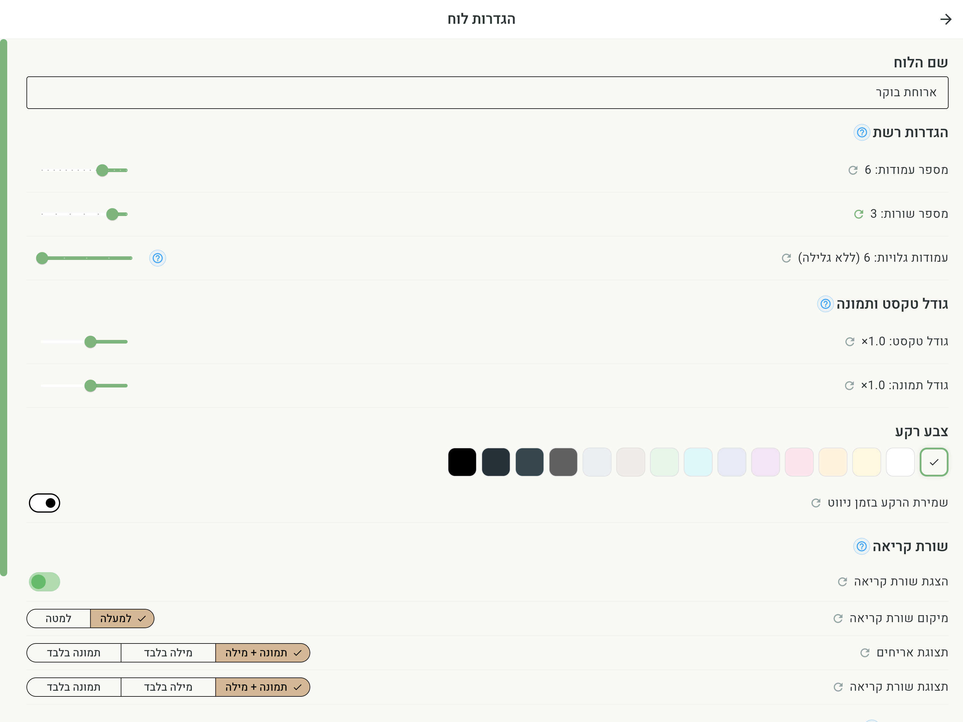
Next to most settings there's a small refresh button — Reset to default. When a setting has been changed from its default value, the button is highlighted, and tapping it returns the setting to its original value.
Board name
At the top of the panel is the Board name field. Type a new name — it's saved automatically. The name appears on the home screen and in search, so it's worth choosing a name that describes the board's topic (for example "Breakfast" or "Feelings").
Grid settings
Here you set how many cells the board has:
- Number of columns — between 2 and 16 (default: 6).
- Number of rows — between 2 and 8 (default: 5).
Resizing the grid may hide tiles that fall outside the new bounds. If you shrink a board that's already full of tiles, tiles left outside the area won't be shown — enlarge the grid again to see them, or move them to a free spot first.
There's no need to enlarge the grid in advance before adding tiles: Multi-add offers to enlarge the board itself when there isn't enough room for the new tiles.
Visible columns
When a board has many columns, you can choose how many of them are shown on screen at once with Visible columns. When there are more columns than shown, you can scroll sideways to see more cells — that way the tiles stay large and easy to tap even on a wide board. When the number of visible columns equals the board's number of columns, the "(no scrolling)" label appears and the whole board fits on screen.
Text and image size
Two sliders set the board's default: Text size and Image size (from 0.3× to 5×). The board image size is used by every tile without its own override. A tile given a custom size in the tile editor keeps it; resetting that override makes the tile inherit the board size again. To adjust a single tile, see Tile Appearance.
The global size set in Accessibility multiplies this effective size. Changing the global size therefore enlarges or reduces both tiles that inherit from the board and tiles with a custom override.
Background color
You choose the board's background color from 15 colors: cream (the default), white, light yellow, light orange, light pink, light purple, light blue, light sky blue, light green, light brown, light gray, dark gray, dark blue-gray, near-black, and black. Dark backgrounds suit those who prefer inverted contrast — see also Accessibility.
Keeping the background while navigating
When the Keep the background while navigating toggle is on, this board's background color keeps following you even when you move from it to other boards through navigation tiles. This is useful when you want a whole "world" of linked boards to feel uniform.
Reading line
The reading line collects the words tapped on the board, letting you build a whole sentence and play it with one tap. A full explanation of working with it is on the Reading Line page. Here you set how it looks on this board:
- Show reading line — turns the line on or off on the board (default: on).
- Reading line position — Top or Bottom (default: top).
- Reading line display — what's shown for each word in the line: Picture + word, Word only, or Picture only.
Tile display
The Tile display setting determines what's shown on all the tiles in the board: Picture + word, Word only, or Picture only. For example, for users who already read you can switch to "Word only", and for those who communicate through pictures — "Picture only".
Here too, a single tile can be given a different display from the rest of the board through the tile editor — see Tile Appearance.
Opening board
Near the end of the list is the Open automatically when the app starts switch (with a ? icon explaining the option). When it's on, this board becomes the "opening board" — the app opens straight into it on every start, instead of the home screen. There can be only one opening board: turning the switch on for another board moves the choice to it, and turning it off restores opening on the home screen. The choice can also be managed from the general settings screen.
Emorli boards, the special boards and boards received from professionals can be an opening board too. On the home screen (in edit mode), tapping such a board opens a menu with Board settings — showing only this option.